DNN 9: WORKING WITH COMMON COMPONENTS IN THE PERSONABAR
Previously, we called an existing Web API from the persona bar. In this blog post, we’re going to take a look at how to use some of the common components provided.
Useful Blogs
Before we proceed, you may want to reference these blogs:
1. DNN 9: Persona Bar Architecture
2. DNN 9: Extending the Persona Bar
3. DNN9: Adding a ReactJS App to Persona Bar
4. DNN9: Diving in a ReactJS Persona Bar Extension
5. DNN9: Calling an existing Web API from the Persona Bar
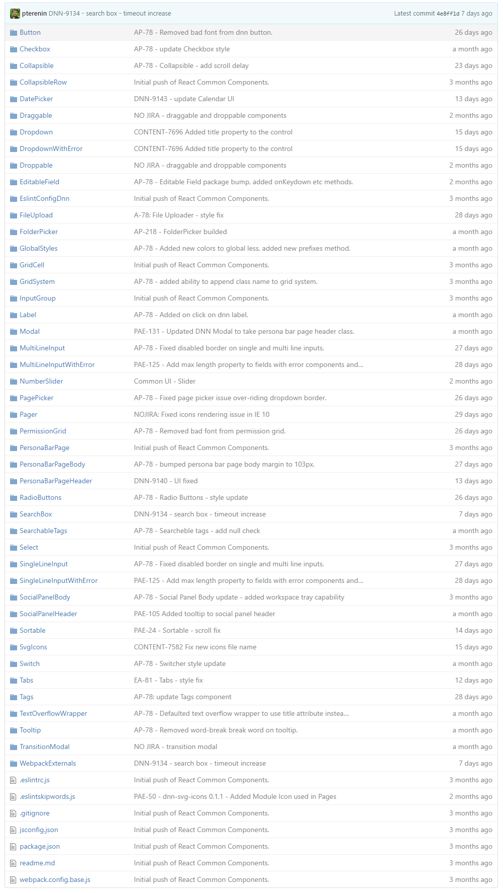
In this post, we’ll start off by taking a look at some of the common components available through myget. As you can see, there is quite a long list of these common components.

In the previous blog post, we worked with the Grid Cell component to set up our user table. In this blog post, we’ll be taking a look at these common components:
1.) Tabs – These tabs allow you to show data in a tabular manner, easily switching from one view to another.

· Tab props used in this example:
o selectedIndex – this is the current index of the selected tab (0 is the first). If not set, the component will keep its own internal state for the selected tab.
o onSelect – this is the function to update the selectedIndex of the tab component
o tabHeaders – these are the headers that are printed out on the tabs, it takes an array of strings or HTML
o children – these are the elements printed in each tab, the count of this should match the header count (ie 2 headers, 2 children)
2.) SingleLineInputWithError – hefty name, but it’s exactly what it is. A text input with the capability to add an error state.

· SingleLineInputWithError props used in this example:
o value – the value of the text input
o onChange – the function to update the value of the text input
o error – whether or not to show red underline and icon
o label – the label on top of the input (First Name)
o style – inline style (takes a JS object)
o tabIndex – the tab index of the input
3.) Button – it is what it is – a button that comes prestyled with the default persona bar styles.

· Button props used in this example:
o label – the text inside the button
o type – primary or secondary, primary being the full blue button
o onClick – function to run on click
4.) Switch – a simple toggle component toggling between on and off on click.

· Switch props used in this example:
o label – the label on the lefthand side of the switch (Authorized)
o value – the value of the switch (T/F)
o onChange – the function to run on change
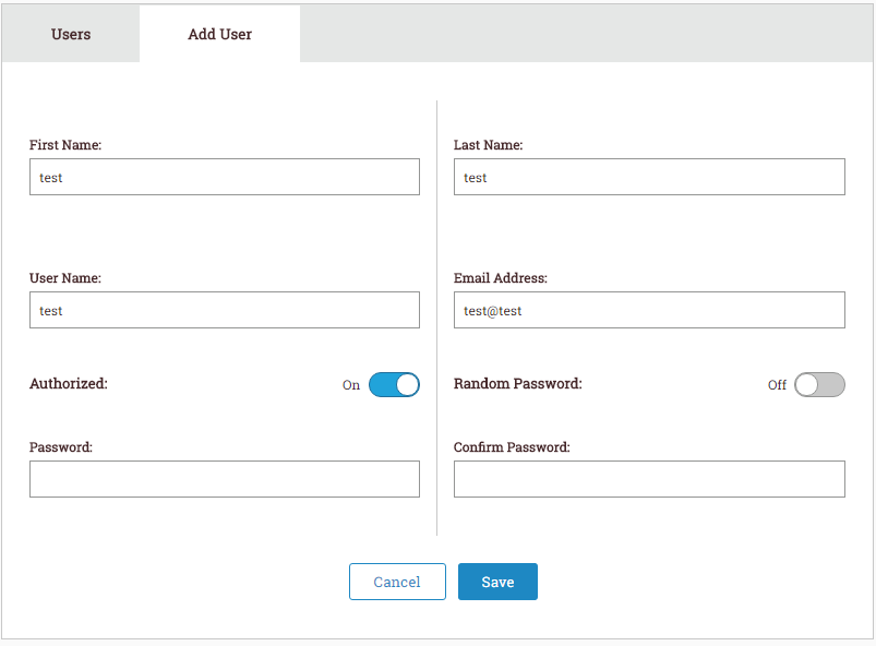
In this case, we are using these components to create the UI to add a new user.

In the screenshot above, we are using several common components. Let’s walk through this.
1. The first thing we notice are the two tabs: User and Add User. This UI was created via the Tabs component, specifying the two tab headers and two components inside each, so our tabs component can load the appropriate tab when clicked.
2. Now, for the Add User UI. To set up the two column layout, we are using two Grid Cell components.
3. On the left hand side, we have three Single Line Input with Error components, along with a switch component.
4. On the right hand side, we also have three Single Line Input with Error components, along with a switch component.
5. On the bottom of the add user box, we are using the Button component, cancel having no type set (defaults to secondary), and Add having type “primary”, which turns it into that blue color.
Note: To add validation, you must keep track of the error states in your application, and assign the error flag to each component accordingly. (See props from single line input with error above)
To add create a user functionality, we can take advantage of the props available in these common components. See the code for an example of the implementation on how to create a user using the new Web API.