Early on in the work on enhancing the profile, it became clear that if we provided the capability for administrators to add profile properties, then we could no longer predict what profile fields there would be and furthermore, what datatype these fields would have.
It thus become obvious that we would need a dynamic Form generator, and once we started analysing the requirements for the generator, it became obvious that this control would have multiple uses.
Enter the new PropertyEditorControl (and its siblings the CollectionEditorControl and SettingsEditorControl). The PropertyEditorControl can be used to edit/view an Info class. The CollectionEditor is used for managing the Profile Properties and the SettingsEditor provides similar functioanlity for a Hashtable of Settings.
A full description of how this new control can be used is way beyond the scope of a blog like this. However, I will try to give a taste of its abilities.
Lets look at the new UI for Editing a User.

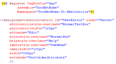
This looks like a fairly standard Edit Page. However, this is a single property Editor control, as shown in the html below.

The @Register directive and the single control declaration is all that is needed in the ascx file to generate the UI shown above.
The code behind is even easier. In the DataBind method the following code is used to bind the control to the User object.

and in the Update Event Handler the following code is used to retrieve the data from the Control and update the User

Pretty easy - right. Of course the actual code-behind file contains more code than this but this is all the code neccessary to bind and update the five properties of the User shown in the first image.
The PropertyEditorControl is controlled by Attributes that decorate the Class that is bound to it (in this case the class was the UserInfo class).
There are a number of Attributes that are supported:
- BrowsableAttribute (or Bowsable) - determines whether the property is displayed
- CategoryAttribute (or Category) - determines the category (or group) that this property belongs to - can be used to gether with the GroupByMode property to control whether the editor uses Group Headers
- IsReadOnlyAttribute (or IsReadOnly) - determines whether the property is editable or readonly (the UserName property above has the IsReadOnly Attribute)
- EditorAttribute (or Editor) - controls the editor that is used to edit the property (checkbox, text box, rich text editor, dropdown combo etc.)
- RequiredAttribute (or Required) - provides Validation if set to true
- ControlStyleAttribute (or ControlStyle) - provides custom styling for the property
- LabelModeAttribute (or LabelMode) - controls where the label is displayed (None, Left, Right, Top, Bottom)
- SortOrderAttribute (or SortOrder) - controls the order of the properties in the editor, as long as the mode of the Editor (see ascx file above) is set to SortOrderAttribute.
Lets look at an example.

In this example the Username property is decorated with three attributes. The UserName row in the editor is the first row (sortorder = 0), is required and is readonly.
This is just a taste of what this control can do.