 DotNetNuke 6 has been a release experience unlike any in the history of DotNetNuke. We have had more packaged releases, more visibility into the code, more discussions with the community and a greater iterative approach to development than at any point in our past.
The community has been able to follow along with us as we progressed from the early UI concepts to a much more polished and refined look. If you were really adventurous, you could watch this transition on almost a daily basis as we kept up a steady stream of code updates on CodePlex. Because we intentionally moved to a longer release cycle, we have been able to go through many iterations, getting community feedback all along the way. With each release our community has told us what they liked, and what they didn’t. After each CTP we have been able to incorporate some of the feedback to help arrive at a much better product. As a result we have been able to progress to what we think is a much more contemporary look, even while taking into account the needs and desires of the overall community. This is just not something that was possible when we were operating under shorter release cycles.
In order to truly appreciate how dramatic this transition has been I thought I would share the progression of one of the central UI elements for DotNetNuke – the login screen.

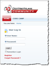
In CTP 1 we had not begun any of the major UI changes and you can see the same login experience we have had since DotNetNuke 3.0. There have been some changes to the way that logins work under the covers, but the UI appearance has been relatively static for a long time. Notice the harsh contrast between the labels and the background as well as the blocky appearance of the login button. The default red used for the link buttons is also overly harsh and distracts the user from what should be their primary focus. Overall, this is not a very polished look and personally I will be happy to leave it behind.

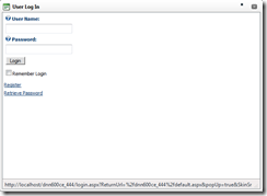
In CTP 2 we introduced the concept of modal popups as a key element of the new UI makeover. Our first foray into the use of popups relied heavily on Telerik ASP.NET AJAX components. This was ok but didn’t provide a very contemporary look. We were also not overly excited about the HTML that was generated by the use of the Telerik window. It made the page heavier than we liked, and was not as designer friendly as other alternative approaches.
One of the great features of the Telerik window is that it allowed the user to resize and move the popup window. It also allowed the window to resize itself to accommodate different pages that might be displayed in the window. Other than the use of a popup, we didn’t spend much time on styling the login control itself. CTP 2 was a good first effort but clearly needed a lot more work.

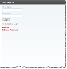
CTP 3 saw a number of dramatic changes. In this release we transitioned to the use of jQuery UI based popups. We also started applying some new styling to the login form itself. What is not apparent from this screen shot is that our popup forms were a fixed size. Since there was no auto-sizing available with the jQuery UI, we had to pick a popup size which would accommodate many of the larger pages like Admin and Host settings. This created a very unappealing experience on the login screen which looked very odd with all that extra white space.
In addition to the change in the popup style, we also started work on styling the rest of the screen. Here we can see very preliminary work. Colors are more muted, corners are a little less harsh and the page looks a little more stylish, however there was still lots of room for improvement (pun intended).

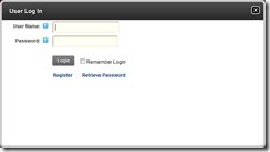
In the upcoming Beta 1 release, you will see a much more polished UI. The login screen is back to being sized more appropriately and the screen is now completely styled using the new DotNetNuke 6 design. All of the harsh corners and sharp contrasts are gone and in their place are nice subtle gradients, soft edges and a color palette that doesn’t seem like it was designed by the same people who created thebiguglywebsite.com.
We still have some additional tweaks coming before the final release but I think that most people looking at these screenshots would agree that the progression from DotNetNuke 5 to DotNetNuke 6 is like night and day. We really have been listening to the community on this release. We are interested in what you think of the new design and will certainly keep your feedback in mind as we work to finalize the 6.0 release. I know I am personally very excited by this release and I’m extremely proud to have been a part of the DotNetNuke 6 release effort.