I have often heard it said that people have difficulty creating skins for DotNetNuke. I am always baffled when I hear these comments especially in light of what I see in the competing skinning engines on other platforms. In this series of posts I’ll be looking at the basics of DotNetNuke Skinning, creating a complete DotNetNuke skin and associated containers, dispelling a few Myths and Misconceptions about DotNetNuke Skinning and finally we’ll wrap up the series by comparing the DotNetNuke skinning engine with those of some other web platforms.
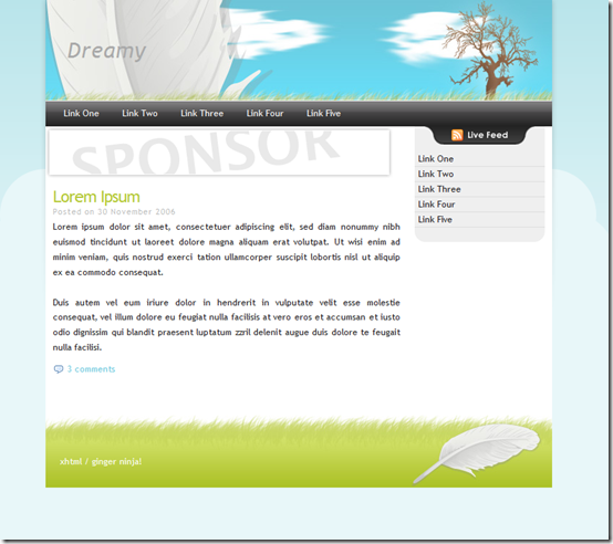
During the course of this series, we’ll be working towards building and packaging a skin that is based off of the Dreamy design template from the Open Source Web Design site. This template uses a very simple design layout which should work well for explaining the basic concepts of DotNetNuke skinning.

Building Containers
DotNetNuke breaks up our “themes” into two different parts – skins and containers. In part 1 and 2 of this series, I showed you how to make the page layout portion of a DotNetNuke Skin. It can be a bit confusing to new users because the term skin is used to describe the entire “theme” and also to describe the page layout portion of a complete skin package. Containers are a much easier term to understand and will be the focus of this post.
Background
A DotNetNuke website consists of a set of pages on which the user places and configures one or more modules. In order to integrate the module into your website the framework wraps your module in a DotNetNuke Container. Containers are designed to coordinate with the corresponding skin as one element in a unified design and are used as a frame around your individual bits of content. Containers provide the ability for designers to seamlessly integrate modules from many different developers into a single cohesive site design. Since the designer has complete control over the appearance of the container, they can choose to visually frame content or to even have content blend in with the rest of the page elements such that there is no differentiation to a normal end user where one module ends and another module begins. Containers can also include visual elements which allow the user to interact with the module. At a minimum, most containers will include the Module Action Menu that administrators and editors use for configuring the module.
Your DotNetNuke site can be configured with a default container which can then be overridden by both individual pages and modules. Even though a set of containers may be designed for use with a particular skin, you are free to mix and match any container with any skin and to use several different containers on a single page. This flexibility is one of the great strengths of the DotNetNuke Skinning engine as it allows a small set of skins and containers to provide for many different layouts and designs for a given site.
Our First Container
Much like skins, containers have a very basic requirement – they must contain a single content area. This content area must have an ID of ContentPane. When I created panes in my skin, I used divs and made sure to include an ID and a runat=”server” attribute. As previously mentioned, I could also create panes with TD, P and SPAN tags as well. There is a second option that I didn’t show in the previous post that allows us to use a skinobject to generate the content pane.
I find this method to be a bit of overkill and not nearly as flexible as just using one of the standard HTML tags with the runat attribute. The skinobject approach will always generate a div. For my first container I’ll just use
The Normal class is a standard DotNetNuke class that ensures our content is using the standard fonts. The c_contentpane class will allow us to control the appearance of our container. I prefixed the class name with c_ in order to differentiate my container contentpane from the skin contentpane. I definitely don’t want them both using the same CSS.
This basic container will allow me to see my content, but it is not truly useful yet. For most containers I will want to include some standard skin objects that provide additional functionality to the user depending on their permissions. The table below lists the skin objects that are relevant for use in containers.
| ACTIONBUTTON |
ACTIONS |
DROPDOWNACTIONS |
| ICON |
LINKACTIONS |
PRINTMODULE |
| SOLPARTACTIONS |
TITLE |
VISIBILITY |
For most containers I will include at a minimum the ACTIONS, TITLE and ACTIONBUTTON skin objects. Many of the other container skin objects are just alternative forms of these three main skin objects. Containers generally will include a header, body and footer section so I’ll go ahead and add those into my container.
In this bit of code, I have added in the DNN 3 style of skin object tokens to make it easier for you to see my HTML structure without being cluttered with a lot of object tags which can be a little verbose. I will replace these with the more modern object tags in the final containers. If you wish to copy or modify this design, make sure to use the files which I provide at the end of this post which includes the final working code samples.
With our basic structure in place, I can create my container.css file that will include all of my standard CSS. I’ll override this in the container specific CSS files for each container type.
.c_container {
    padding-bottom: 15px;
    margin: 5px 10px;
}
.c_actions, .c_icon, .c_icon > img, h2.c_title {
    float: left;
}
.c_actions {
    height: 2em;
    line-height: 2em;
}
.icn img {
    margin-right: 5px;
}
h2.c_title {
    margin: 0;
    padding: 0;
}
.c_contentpane{
    padding-top: 5px;
}
.c_left_actions {
    float: left;
    margin-top: 5px;
}
.c_right_actions {
    float: right;
    margin-top: 5px;
}
.clearfix:after {
    content: ".";
    display: block;
    height: 0;
    clear: both;
    visibility: hidden;
}
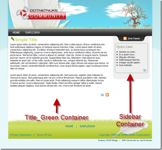
Because I will be using a fairly simple container design without a lot of graphic elements, I plan to re-use my basic structure for all of the containers I am designing for my skin. I try to plan my containers so that the only thing I need to change is some CSS in order to achieve a completely different look. Anyone who has ever visited CSS Zen Garden will understand that with a well designed HTML structure you can achieve an endless variety of designs. With DNN I can include container specific CSS by naming the css file with the same name as the container file. For example, my standard container is called Title_Green.html so I will create a css file called Title_Green.css.
.c_green h2.c_title {
    color: #b5c936;
}
One of the major differences between a skin and a container is that there will only be one skin on a single page. This allows us to share the exact same HTML between skins and only alter the associated CSS file specific to each layout. Since I can have multiple container types on the same page I need to have some way to differentiate each container type. To accomplish this I includes a single class in the root DIV that allows me to designate which CSS to use when I have multiple container types on the same page. Notice in my css above that I have used the c_green class to override the styles in the container.css file. Also, because you will have multiple containers on the page you should avoid the use of ID’s on your HTML elements and instead rely on classes for providing the necessary CSS hooks.
Wrapping it Up
Now that we have our basic HTML and basic CSS in place I can create a new container by just creating a container specific html and css file for each container. The only difference in the HTML files will be the class in my root DIV. So in order to create my container for the sidebar, I change c_green to c_sidebar in my sidebar.html file. In my sidebar.css file I include the following CSS.
.c_sidebar h2.c_title {
    color: #808040;
    font-size: 1.4em;
    font-variant: small-caps;
}
.c_sidebar .c_head_title {
    padding-bottom: 3px;
    border-bottom: 1px solid #797;
}
div.c_sidebar {
    margin: 10px;
    padding: 5px 7px;
    border: 1px solid #797;
    border-radius: 10px;
    -moz-border-radius: 10px;
    -webkit-border-radius: 10px;
}
.c_sidebar ul {
    margin-left: 12px;
}
Using this pattern, I can create as many different containers as I need for my design with very minimal effort. As I did in my skin, I have used some CSS3 styles in my container to provide a little extra polish in those browsers which support it (in this case you will get rounded corners in FireFox and Webkit and square corners in IE).

This completes the creation of our basic containers. Feel free to download the source files from the DotNetNuke Forge and continue modifying my existing containers and creating new ones of your own. The files are packages just as they are stored in DotNetNuke and they are not ready for installation. You will have to manually move them to the appropriate folders if you intend to use them.
In Part 4 of the series, I will show you how we package these files into a proper DotNetNuke skin package.
This blog post is
cross-posted from my personal
blog.