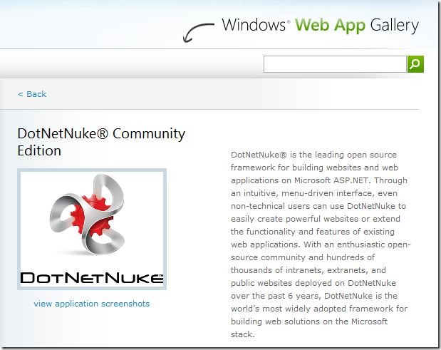
The evolution of DotNetNuke branding is well chronicled in chapter 1 of the Wrox Professional DotNetNuke 5 book but a lot has happened since Shaun and Nik originated the current logo concepts way back in 2005. The ever increasing capability of digital media processing has increased our appetite for resolution, detail and as Hollywood has proven, dimension!
As it turns out, however, the basic design of the gear and triad has not only withstood the test of time, but become a well known and respected symbol of our company and our community. We’re stepping out with giants like James Cameron and Pixar to stake our claim in the 3D future-world, but you won't need 3D glasses for our new logo!
The new logo retains all the recognition of the current brand but adds the texture of chrome. For some this will harken back rebel days of a “tubular chrome” skin and thoughts of “cool”, attributes which have been important to our past and continue to be important to our future. For others chrome might represent the “steel” of commitment and resolve that users have come to expect from DotNetNuke. The gear is made more prominent, adding dimension to its teeth and is anchored on a small drop shadow.
 |
A key consideration for our new logo design was just as Shaun once articulated it, “Would my wife permit me to wear clothing embossed with the logo when we went out in public together?”
We’re pleased to acknowledge that Jo-Lynn, Allison, Gloria and Savitha still approve! |
Along with our updated logo, we’re providing a Logo Center for convenient access to images that can be used in accordance with updated logo guidelines. You can expect to start seeing our new logo in public immediately, it’s already in the Windows Web App Gallery!
